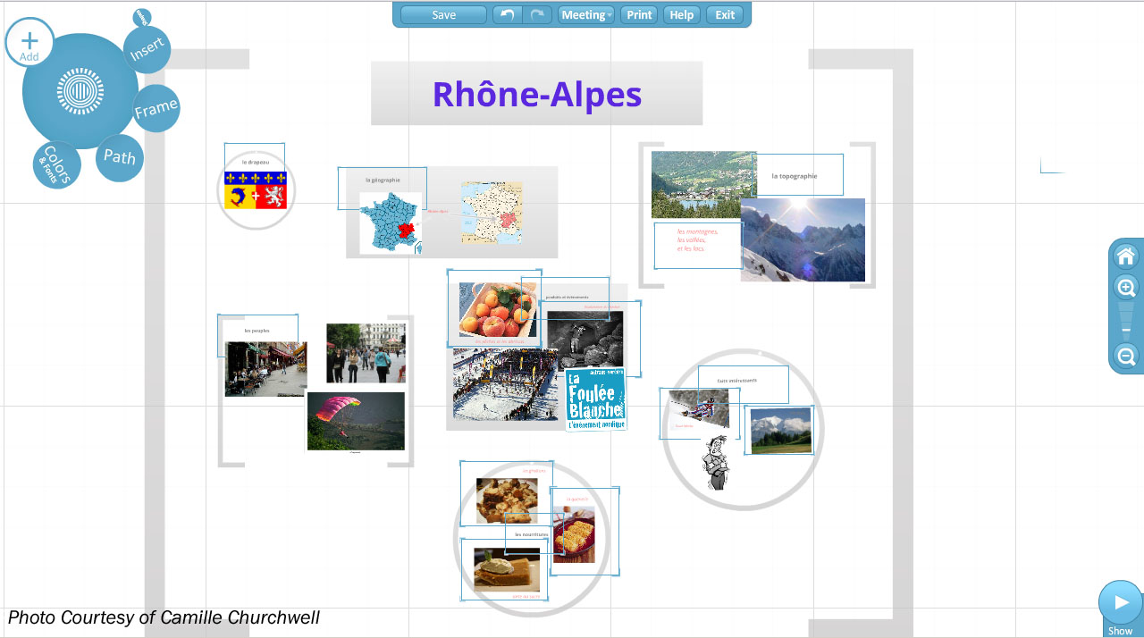
My peers’ presentations blew my mind while in French class. It zoomed to various photos and headers, it was interactive and like no other presentation I had witnessed. My frumpy, boring PowerPoint would never live up to their presentation’s level. They used Prezi, which is an interesting, gripping way to present information. Prezis are described as, “visually captivating presentations that lead your audience down a path of discovery.”
Captivated by their presentation, my teacher took note of the magical site. A few months later, she assigned a project using Prezi. I was extremely excited to produce a presentation like the one I saw.
After creating my account, I rushed to create a new storyboard. I soon realized that I had no idea how to work Prezi. I clicked around, selecting “frames” and “paths,” but nothing took shape. It was at that moment, that I concluded Prezi is not user-friendly.
I could easily navigate a PowerPoint, but Prezi was foreign to me. Swallowing my pride, I asked one of my group members for help. She attempted to explain the wonders of Prezi, claiming it was “easy.”
Lane Hering, junior and fellow group member, said, “It took me probably 3 hours out of my first 8 hours of working with it. It takes a little bit to get used to it, but after a while it gets much easier.”
Prezi, described as “eye candy,” allows easier transitions and smoother effects. Perhaps inserting photos is more complicated, because Prezi doesn’t allow copying and pasting from the Internet. Prezi also limits the amounts and colors of fonts, and themes that are available.
However Simon Burke, junior, had an experience similar to mine, “I didn’t like it at all, I thought it was super confusing to use.”
Many teachers are beginning to make the switch from PowerPoint, to Prezi. Prezi allows users to embed YouTube videos, which are used as learning tools in the classroom. Ms. Anderson, English teacher, assigned a project using Prezi last semester. “Prezi is not as user-friendly as PowerPoint, but it’s more dynamic and has a novelty to it.”
Hering, agrees, “It’s the best presentation. It is so much better than PowerPoint. It has more movement when it takes you from one place to another.”
“PowerPoint is much easier to use, everything is labeled, while Prezi has fewer words,” said Burke.
I fully agree that Prezi is a better way to present information, but it has its downfall. The technicalities that Prezi presents its user with, are frustrating and time consuming. PowerPoint is still a great way to present, it just isn’t as interesting. It is more self explanatory than Prezi, which can be priceless while working with a deadline.

Leave a Reply