The glory days of MySpace are long gone after a drastic fall from grace and the rise of Twitter and Facebook, but everyone should still remember those times. After years of “Top Friends” and profile songs, it looked like MySpace would never rise again.
With the help of Justin Timberlake, a new investor in the site, Specific Media hopes to relaunch MySpace soon.
The name may not be different, but the site certainly is.
The new MySpace is completely centered around music — finding artists, streaming music, watching music videos and even making photo mix tapes, a feature where you attach photo albums to playlists you create. It’s taken the old MySpace’s greatest trait and amplified it.
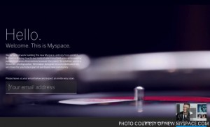
Right now, though, the new MySpace is only a sleek home page featuring a shot of a spinning record playing in a loop in the background. The white words welcome any visitor to MySpace, and explain everyone is “hard at work” building the new site “from scratch”. Those same words instruct to leave an email address, and then assure you’ll receive an invitation soon.
Underneath these words, almost hidden in the corner, is a preview video.
The preview video depicts a brand new design for MySpace. It looks like music meets Pinterest. The photos and playlists have a new look, but the biggest difference lies in the interface: horizontal scrolling.
Whether or not scrolling side-to-side as opposed to up-and-down will be a benefit in the end, or if it will just be a nuisance, is debatable. The scrolling could be annoying on a computer — the change in direction disorienting. Even so, smartphones are such a huge part of social networking, and the horizontal scrolling seems fit for a tablet’s screen.
With the new MySpace, anyone can search for artists and albums and find concert dates and new music.
Even though Justin Timberlake’s presence as a highly followed and popular artist in the video seems a little narcissistic — for whatever reason, it seems his influence as co-owner helped in the choosing of a celebrity for the video — the rest looks interesting. The photos and interaction between stars, music, and their followers is a little something else for the die-hard celebrity and musician fans.
However, the new MySpace looks as though it could be completely monopolized by the large label bands and stars filling pop culture today. Those stars have access to the sort of media (photos, videos, etc) featured in the preview video. If the majority of MySpace’s celebrity users are the latest zeitgeists to craze America, could MySpace develop into a site simply devoted to pop culture?
On the old MySpace, everyone could find new music from small, beginning bands, but the new MySpace looks like it could be a steaming pot of popular commentary. Instead of finding great, new bands, a MySpace user might discover new music from bands who have already made it big or started to. If smaller bands ever joined MySpace, they may lack the general media featured on Justin Timberlake’s MySpace page during the teaser video.
For anyone looking to discover something truly new and not just another band signed to a major record label, are they out of luck?
One could also argue in favor of Pitchfork, a site completely devoted to music and reviews, usually of indie bands — not just another line of commentary on pop culture. Pitchfork does provide streaming of some songs, but it is not a website one usually thinks of as being built for music streaming.
Music streaming is almost exclusively controlled by Spotify, a service allowing one to listen to a wide array of music by searching for a specific song or artist, listening to a playlist, or a radio station similar to its competitor Pandora. The new MySpace has clearly encompassed ideas from these two sites, but does not necessarily do anything better than these sites on their own. The greatest perk from the combination seems to be the added glitzy interface and retro-styled graphics. What, then, makes MySpace even worth the wait for an invite or worth registering at all?
In the end, the greatest thing they have to offer is MySpace’s encouragement of a relationship between musicians (or celebrities) and fans. As seen in the video, MySpace offers a “This Week’s Top Fans” feature, giving star-crazed lunatics an opportunity to show their love in a more-improved way than spamming their favorite artist on Twitter.
The way it looks now, despite the eye-catching interface, the newest MySpace relaunch looks disappointing. For those devoted to popular culture, MySpace may seem perfect, but for anyone looking for a garage band on the rise, it may fall flat. The site will relaunch with the help of Justin Timberlake’s many celebrity connections, giving the site at least some sense of gravity, but the jury is still out on whether we even want MySpace anymore.

Leave a Reply