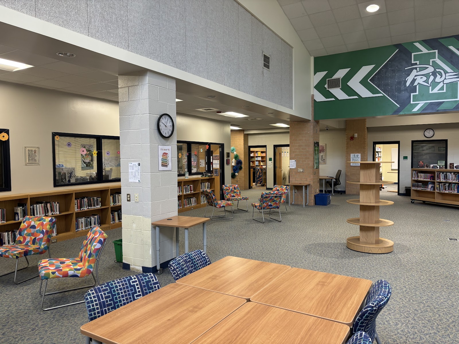
Very soon upon going to the media center, students enter into a space with more seating, and a very open design.
The checkout desk has been moved to the center of the space, and is circular as opposed to just a counter. This will make the media coordinators more visible to people around the entire library.
Also, most of the tall, circle displays have been removed or moved to the outer edge, and replaced with lower, smaller circle displays to further contribute to the openness at eye level.
“The modern school library is a multi-use space for the entire school community,” said Dr. Christina Counts in her paper about modern school library design.
As for Leesville, the project seems to be going well. “So far, so good. The space feels more open and inviting,” said Mrs. Huff, media coordinator.
The media staff have also been working hard to make these changes happen.
“We are very excited about all the changes. We think the students will love the new design, but as with all new things, we are going to have to work out the logistics as they come, and be as flexible as possible,” said Mrs. Huff.
The seating is all very comfortable and modular, meaning that it is a very adaptive space that is meant to be inviting for students to learn and thrive.
Dr. Counts wrote, “Soft, comfortable chairs are great for students who want to sit and read or work independently.”
“The key is to offer a variety of choices, so students can work where they’ll be most comfortable and productive to accomplish the task at hand,” said Dr. Counts.
Modern school libraries should be a place where students can do a variety of activities — such as reading, studying, or working on a project — in an open, comfortable environment. Leesville seems to have achieved just that in the redesign of the media center.


Leave a Reply